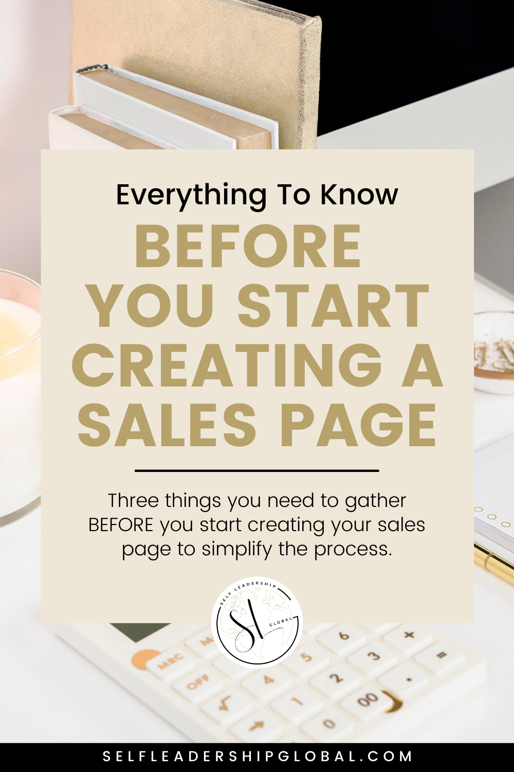
Sales Page Design Prep | Organize Your Sales Page

Feeling overwhelmed with your sales page design? 🙋🏻♀️
Whether you're a sales page first timer or revamping a sales page that isn’t converting the way you would like, you’re in the perfect place, Coach!
I’m going to give you the preparation tools and strategies you need to simplify the process of organizing and designing your sales page.
AND, don’t forget to stick around to the end because I’m sharing info on my favorite sales page resource that will help you create your sales page in a weekend so you can start getting your offers out to the world by next week! 👇🏽👇🏽

Sales page design is about creating and maintaining visual interest so that your ideal clients stay engaged and enroll.
In fact, once someone starts scrolling on your sales page you have between 8-10 seconds to keep their attention.
There are very real, simple strategies that you can use to boost your sales page branding to stimulate the eye, keep your ideal clients attention, and support engagement… meaning they’ll be looking at something, reading something, or doing something on your sales page!
In order to help you out (the way I wish someone would’ve helped me out), I’m going to share with you three things you need to gather BEFORE you start creating your sales page to simplify the process.
Sales Page Design Prep #1: Gather Images
Your sales page is going to include a combination of 3 image types to maintain flow and visual stimulation.
The first image type is Images of you. Throughout your sales page you’ll be using images of you to build rapport, trust, and brand recognition.
These images can be used as background transitions, within your bio section, and more!
As you’re choosing brand photos for your sales page keep in mind to use up to date images that reflect exactly who you are with clothing, body language and facial expressions.
Also be sure your images are high quality and include either full body shots, and or shots from the waist up! Additionally, it’s important to get a few of your favorite photos with a transparent background so you could use them in multiple ways.
The second image type is stock photos. When choosing stock photos to add on your sales page think about simple images that relate to your offer.
You can use these photos as background images, when sharing information about what your audience will receive in your offer, in module graphics and more!
Some of my favorite places to get free stock photos are:
- Pexels
- Unsplash
- Kaboompics
- Reshot
- StockSnap.io
The third image type are Course & Program Images. Have you ever been scrolling on a sales page and stopped when you saw the offer image bundle?
There’s something about seeing an image of everything you’re going to receive to get you to stop and consider the offer. That’s why before you start designing your sales page you’re going to create a few very important images. These include:
- Offer Image Bundle which is basically an image including a screenshot of inside your course, workbook cover pages (or templates if you have them), a forum visual if it’s included, and any bonuses that are included.
- Next are Module Images. Your sales page will briefly describe what’s included in each module or lesson you’re providing. Many people create simple graphics to differentiate between modules.
- Then lastly are Bonus Images. Your offer will most likely include some sort of bonuses. It’s important to not just talk about these bonuses, but also SHOW the bonus in some way, shape or form!
The important thing to know about these images is that you want them all to be simple, clutter free, and on brand.
Ya see, less is definitely more when it comes to sales page design and the images you use. Clutter creates confusion.
So we don’t want your images to be too busy (meaning too much color, or too much going on), as well as to not include enough white space or empty space.
Overall, when thinking about your sales page images I suggest going for a minimalist, clean look so it doesn’t distract your viewer.
Sales Page Design Prep #2: Gather Brand Colors, Fonts & Patterns
Your sales page is a direct reflection of your branded offer. This includes the brand colors, fonts and patterns you use throughout your offer.
Now, it can be tempting to include a ton of color, or fancy script fonts, and bold patterns but that doesn’t always provide the best experience for the viewer.
One of the main goals of sales page design is to keep your ideal scrolling.
You do this with the perfect amount of color, and easy to read fonts that represent your brand vibe.
So, to start, focus on using your brand colors for tasteful color transitions. What do I mean by this? On sales pages specifically, there are 16 different sections and it’s important to distinguish between these sections with background colors and images. You want it to flow!
Now, a good rule of thumb is to use a lot of blank space regardless of your background color. For example perhaps one section has a white background, and then black easy-to-read text with POPS of your brand colors in your headings.
You’ll want to be sure that your color palette is complementary, and that your visuals are simple and pleasing to not overwhelm your audience.
Additionally, font pairings matter, so you’ll want to do a little research on this. When it comes to fonts, you can use the same font family for subheadings and your base font then a different font for your headings.
Or if you are using different fonts for your headings, subheading and base fonts, have them be obviously different.
If you’re getting a little confused on this don’t panic! One of the best places to research this is Pinterest. They give you SO many examples of beautiful font pairings based on your brand vibe, and I’m completely confident that you’ll find a pairing that’s PERFECT for you!
So ultimately, the goal is for your sales page to be a breath of fresh air! You want it to grab your viewers interest, be visually engaging and extremely easy for the perfect people to enroll in your offer.
Remember, too much stimulation can cause mental chaos which is the opposite of what you’re looking for.
Sales Page Design Prep #3: Get Your Sales Page Tool
Now you’re ready for a sales page tool or platform to share your sales page with the world.
Tools and platforms like Kajabi, Clickfunnels, Lead Pages, Convert Kit, and Instapages will make your life SO MUCH EASIER.
They’ve done the research, tested different designs, and tried out sales page layouts, so they recommend layouts that are proven to have success!
They all have simple drag and drop options, and examples which will increase your confidence and motivation to get things done!
I’ve personally used Kajabi for everything in my business model since 2013, including my sales pages, and if you want to know WHY and what I use it for go ahead and click here to see the backend of my business.
I’ve tried going to other platforms, and Kajabi was the simplest all in one tool I’ve used.
So, if you’ve been researching Kajabi to see if it’s the right fit for you, now’s your chance to try it FREE for 14 days.

Sales Page Design PRO TIP: Break Up Text With Graphics
One of the biggest mistakes I see on sales pages is that there’s too much text, AND the text is in paragraphs.
Friend, if you want your sales page to stand out from the rest you’ll want to intentionally create opportunities for visual engagement.
In saying that, my challenge to you is to take your long paragraphs or bulleted lists, simplify the message you’re trying to convey, delete any fluff, and ONLY showcase clear, concise content. Then, you can turn any sentences or bullet points into simple graphics.
Here’s an example of this from my sales page for a course I created called The Sales Page Slay Method. You can see here that I’m sharing content in graphics.
I easily could’ve turned this content into bullet points or paragraphs, but instead I created these simple graphics in canva to break up the text. The purpose of this is to visually stimulate my viewers and keep them scrolling!

So now it’s your turn to take a look at your sales page and see where you can break up your text and use graphics and icons to convey your message!
And if you’ve already done this… comment below with the link to your sales page so we can check out your design skills!
Now these 4 Sales Page Design Prep ideas are just the tip of the iceberg when it comes to creating and converting sales pages. As promised, I wanted to share a resource that I created called Sales Page Slay Method.

This is going to walk you through not only mapping out and building your sales page from scratch, but also the process you need to drive traffic to it and SELL it. So go ahead and click here to learn more and get that now!
Until next time, keep building your empire!
xo, KellyAnne
PIN FOR LATER