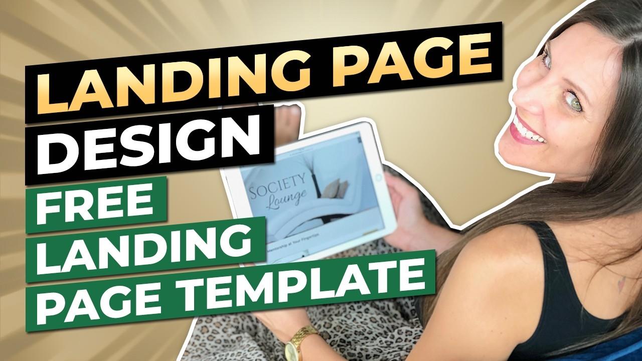
4 Landing Page Design Hacks To Help You Convert | FREE Landing Page Template

Today’s blog is going to support you in designing a landing page that converts!
If you’re someone who’s:
- launching a course
- opening up space in a group coaching program or mastermind
- or taking applications for 1:1 clients
... understanding the art and science of landing pages is extremely beneficial (especially landing pages that are used as sales pages).
AND, to give you some extra support be sure to download the FREE Landing Page Template below!
Okay friend, here we go! One of the best ways to increase your influence, impact and income is by setting up strategic, authentic, high converting landing pages for your offers.
Here are a few landing page design hacks to guide you through your process of creation...
Landing page Design Hack #1: Keep It Clean.
Less is definitely more when it comes to landing pages. It can be tempting to include a ton of color, or fancy script fonts, but that doesn’t always provide the best experience for the viewer.
One of the main goals of landing page and sales page design is to support your viewer in being visually stimulated enough to want to keep scrolling. You want:
- the perfect amount of color
- simple images that relate to your offer
- easy to read fonts that represent your brand vibe
To start, focus on using tasteful color transitions. What do I mean by this? On sales pages specifically, there are about 16 different sections and it’s important to distinguish between these sections with background colors and images. You want it to flow!
Now, a good rule of thumb is to use a lot of blank space regardless of your background color. For example, perhaps one section has a white background, and then black easy-to-read text with pops of your brand colors in your headings. You’ll want to be sure that your color palette is complementary, and that your visuals are simple and pleasing to not overwhelm your audience.
Additionally, font pairings matter, so you’ll want to do a little research on this. When it comes to fonts, you can use the same font family for subheadings and your base font then a different font for your headings. Or if you're using different fonts for your headings, subheading and base fonts, be sure they're obviously different. Maybe you have a fun handwritten font for your headline, and then the body copy is helvetica.
If you’re getting a little confused on this don’t panic! One of the best places to research this is Pinterest. They give you SO many examples of beautiful font pairings based off your brand vibe, and I’m completely confident that you’ll find a pairing that’s PERFECT for you!
Ultimately, the goal here is for your landing page to be a breath of fresh air! You want it to be visually engaging and extremely easy for the viewer to read and navigate. Remember, too much stimulation can cause mental chaos which is the opposite of what you’re looking for.
Landing page Design Hack #2: Break Up Text With Graphics.
One of the biggest mistakes I see on landing pages and sales pages is that there’s too much text, AND the text is in paragraphs.
Friend, I’m going to give you a piece of advice my mentor shared with me early on in working with her. She said,
“Simplify your message down to a word, a phrase or a sentence”.
This was one the BEST and most challenging pieces of advice I ever received because it forced me to REALLY think about what I was trying to say.
In saying that, my challenge to you is to take your long paragraphs, simplify the message you’re trying to convey, delete any fluff, and ONLY showcase clear, concise content. Oftentimes this means short sentences, phrases, and bullet points.
Then, you can turn any sentences or bullet points you create into simple graphics.
Here’s an example of this from my sales page for The Sales Page Slay Method. You can see below that I’m sharing content and quotes I heard from previous clients.

I easily could’ve turned these into bullet points, but instead I created these simple graphics in canva to break up the text. The purpose of this is to visually stimulate my viewers and keep them scrolling!
So now it’s your turn to take a look at your landing pages and see where you can break up your text and use graphics and icons to convey your message!
Landing Page Design Hack #3: Check Your Image & Video Sizes.
This is a biggie! Your page speed on both desktop and mobile matter… big time. If your landing page is taking too long to load, it will increase the chances of people clicking off.
As a matter of fact, a recent stat by Kissmetrics says,
"a 1 second delay in loading your site can lower your conversions by 7%."
If you find that your landing page isn’t loading as fast as it could be, check your image sizes and video sizes. File sizes that are too big are often the culprit when it comes to slow loading times.
AND, a little extra pro tip is that … Page speed is also something Google checks for when they’re crawling your landing page or website too, so having a page that loads quickly will help your SEO as well.
Landing Page Design Hack #4: Mobile Friendly.
At the time of this video, stats show that 50% of landing pages are NOT mobile friendly. This is a HUGE opportunity for you because a majority of your ideal clients will be looking at your landing pages from their phones!
Here’s what’s up friend, think about those times that you go to a webpage or sales page from your phone and you have to scroll to the right or left… because the pictures and text are cut off.
You CLICK OFF, right?!, because it’s wayyyy too much work! The same is true for your ideal clients. Your job, as the badass business owner you are is to check the responsiveness of your landing pages from your phone to be sure everything is lining up properly.
Now, these 4 Landing Page Design Hacks are just the tip of the iceberg when it comes to creating and converting landing pages. As promised, you can download your FREE Landing Page Template to design a landing page that both looks amazing and CONVERTS! This is what I’ve used to create hundreds of thousands of dollars and you can too!
Lastly, if this video was just what you needed in your coaching business, please let me know by sharing it with your coach friends.
Until next time, keep building your empire!
xo, KAZ
PIN FOR LATER

50% Complete
Two Step
Lorem ipsum dolor sit amet, consectetur adipiscing elit, sed do eiusmod tempor incididunt ut labore et dolore magna aliqua.


